Something I just kind of stumbled on to for another client, a useful tool that can put tabular reports in a dashboard item. You don’t want to whole tabular report, but maybe the “top 10 opportunities by dollars” or “customers not touched in a LONG time”. Now, a couple of caveats — you cannot use date fields as a displayed field inside of the dashboard. I find this very annoying, but I’ve gotten around it by doing an aging field based on that date. That works well, but takes a bit so this will be more like 2 tips.
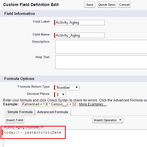
First, let’s create that aging formula field. We’re going to go off the “last activity date” field, so we’ll just create a formula that does some math. Create that new “Activity Age” field (formula field, number field, 0 decimals) in setup using the following formula. Add it to your account record when done.
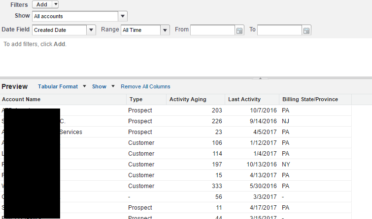
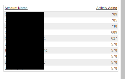
Create your tabular report. Go ahead and create a new report, based on account data. Doesn’t have to be much, as all we really care about is the account name and the new aging field. Don’t forget to change the dates above and make it “all accounts”. Mine looks like this when done.
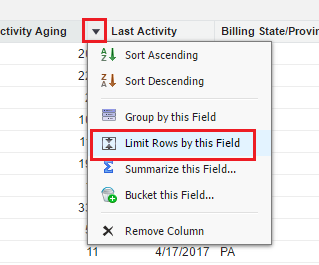
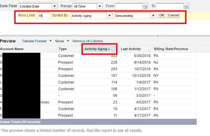
Hard part is to “limit the field” by clicking on the arrow we normally use for sorting. Here’s where we limit the records that we want in the dashboard. What I did here was edit it to the top 10 which is normal, making the sort descending (accounts that need to be touched badly up top).
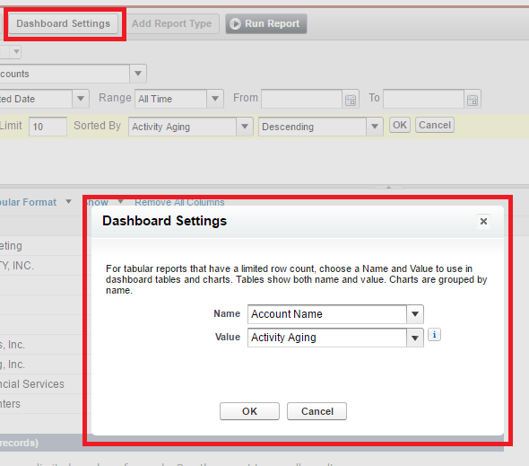
Once you do that, there’s a new button up top to adjust the “dashboard settings”. Click that to determine the fields displayed (you can only have 2) and you need a NUMBER field which is the pain. I tried to do this with dates (using a max/min type of thing) but doesn’t work. Salesforce really wants a number so we use that aging field. If you don’t have a number available, it won’t work and you can’t add this as a dashboard.
At this point, you can now add this data source to a dashboard component and go from there. You could always change these reports as well, making it so that only customers show, or certain products — whatever works for you.
Now, the final item that I think is a nice touch is which report opens when you click the dashboard. In this case it’s going to go to our top 10 report. What I do here is do a “Save As” on the top 10 report, removing that record limit. I name that “List of Accounts by Activity Aging” (something like that), and then save the report. This is the full report.
Since each report is a separate URL, open the report (run it), then copy the URL at the top. Go back to our dashboard and use that URL as the target when you click the dashboard. Click the Wrench for dashboard setup, the component data tab, then the “drill down to”.
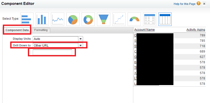
This is a nice final piece and allows the top 10 to preview the full report which users can get to easily.

Hi Corey thanks so much for taking the time to put this up online. I was stuck trying to get a dashboard report to display the last date users generated opportunities. It was a pain getting working on a solution using process builder + your guidelines for getting a tabular report with dates displaying on a dashboard. We ideally wanted to see a date field next to user names, but given the inability of dashboard to cater for this, the aging solution was next best thing.
Glad to help!