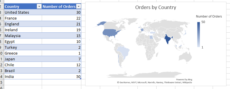
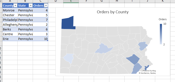
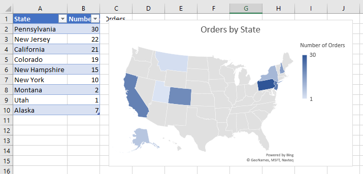
Excel’s charting capabilities are well-known at a basic level—everyone knows that they can create pie, bar, or line charts/graphs with their Excel data. However, Excel also allows you to create geographical charts that automatically plot data on a map. The maps use a “fill” function to show data, so this best shows numerical data by County/State/Country etc. You can plot data by:
Country/Region
State/Province
County
Postal Code
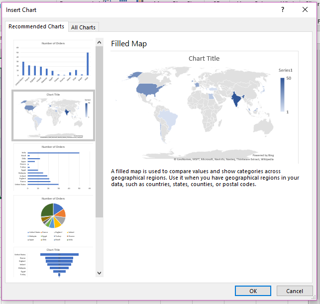
Select your table in full, then select “Insert”, then “Recommended Charts:
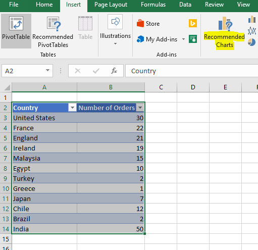
Select the “Filled Map” option and click OK:
Voila! Give your chart a name and make any formatting changes as desired.